<!-- This is an auto-generated comment: release notes by coderabbit.ai
-->

## Summary by CodeRabbit

* **Bug Fixes**
* Improved safe area styling by ensuring a default padding is applied
when certain variables are not set, resulting in more consistent layout
spacing across different scenarios.

<!-- end of auto-generated comment: release notes by coderabbit.ai -->
<!-- This is an auto-generated comment: release notes by coderabbit.ai
-->
## Summary by CodeRabbit

* **New Features**
* Introduced a customizable context menu component for desktop
interfaces, enabling right-click menus in various UI elements.
* Added context menu support to document list items and navigation tree
nodes, allowing users to access additional operations via right-click.
* **Improvements**
* Enhanced submenu and menu item components to support both dropdown and
context menu variants based on context.
* Updated click handling in workbench links to prevent unintended
actions on non-left mouse button clicks.
* **Chores**
* Added `@radix-ui/react-context-menu` as a dependency to relevant
frontend packages.
<!-- end of auto-generated comment: release notes by coderabbit.ai -->
https://github.com/user-attachments/assets/994f7f58-bcbe-4f26-9142-282ffa5025f9


<!-- This is an auto-generated comment: release notes by coderabbit.ai
-->
## Summary by CodeRabbit

- **New Features**
- Introduced an icon and name editor component, allowing users to select
emoji icons and edit names within a menu popover.
- Added an emoji picker for icon selection, supporting theme adaptation.
- **Style**
- Applied new styles for the icon and name editor, including emoji
picker appearance.
- **Documentation**
- Added Storybook stories to showcase and demonstrate the new icon and
name editor component.
- **Chores**
- Added emoji-related dependencies to support emoji selection features.
<!-- end of auto-generated comment: release notes by coderabbit.ai -->
close AF-2678, AF-2677, AF-2674, AF-2655

<!-- This is an auto-generated comment: release notes by coderabbit.ai
-->
## Summary by CodeRabbit

- **New Features**
  - Added customizable spacing for dividers.
  - Introduced a flexible filter value menu for easier filter editing.
- Added options to control visibility of creation actions in empty
document views.

- **Improvements**
- Enhanced menu components for filter values with a more declarative and
simplified interface.
  - Improved vertical alignment in some UI containers.
  - Updated divider spacing for more consistent UI appearance.

- **Bug Fixes**
  - Menu popups for filters now appear in correct positions.

- **Removals**
- Removed support for the "zotero" integration type from integration
settings and filters.

- **Style**
  - Updated CSS for better menu positioning and alignment.
<!-- end of auto-generated comment: release notes by coderabbit.ai -->
<!-- This is an auto-generated comment: release notes by coderabbit.ai -->
## Summary by CodeRabbit

- **New Features**
  - Introduced a "Delete my account" option in mobile settings with role-based warnings and confirmation modals.
- **Enhancements**
  - Added flexible row and reverse row layout options for modal footers and action buttons on mobile.
- **Localization**
  - Added English translation for the "Delete my account" setting.
- **Style**
  - Updated styles for modal footers and action buttons on mobile.
  - Added styling for account deletion dialog descriptions.
<!-- end of auto-generated comment: release notes by coderabbit.ai -->
fix AF-2660

<!-- This is an auto-generated comment: release notes by coderabbit.ai -->

## Summary by CodeRabbit

- **Style**
  - Improved visual appearance of sidebar buttons and quick search input, including reduced sizes, updated padding, and enhanced hover effects.
  - Adjusted layout spacing for quick search and new page elements in the sidebar.
  - Updated share button styling to use the primary variant.

- **New Features**
  - Notification cards now only display messages and action footers when relevant, providing a cleaner interface.

- **Refactor**
  - Removed shortcut hint and spotlight elements from the quick search input for a simplified user experience.

<!-- end of auto-generated comment: release notes by coderabbit.ai -->
close AF-2624, AF-2628, AF-2581

<!-- This is an auto-generated comment: release notes by coderabbit.ai -->
## Summary by CodeRabbit

- **New Features**
  - Introduced a draggable handle to document cards in the explorer, visible on hover in card view.
  - Added an option to remove grouping in the display menu.
  - Added contextual tooltips for user avatars indicating creation or last update.
  - Enabled optional tooltips on public user labels.
  - Extended dropdown buttons to accept custom styling classes.
  - Added a new masonry story showcasing item heights determined by ratios.

- **Style**
  - Enhanced drag handle appearance and visibility for card view items.
  - Replaced static shadows with theme-aware, smoothly transitioning shadows on card items.
  - Adjusted spacing between items in the document explorer for improved layout, with increased horizontal and (in card view) vertical gaps.
  - Reduced top padding in workspace page styles.
  - Added new button background style for secondary buttons.

- **Bug Fixes**
  - Removed duplicate internal property declarations to eliminate redundancy.

- **Refactor**
  - Simplified layout props by removing fixed height parameters in multiple components.
  - Updated masonry layout logic to support ratio-based item sizing alongside fixed heights.
  - Removed randomized skeleton loading placeholders, replacing them with fixed or no placeholders.
  - Refined masonry component typings and scrollbar placement for improved styling and layout.
  - Improved selection logic to activate selection mode when selecting all documents.

- **Localization**
  - Added new translation keys for grouping removal and user attribution tooltips.
  - Updated English locale with new strings for "Remove group" and user-created/updated tooltips.
<!-- end of auto-generated comment: release notes by coderabbit.ai -->
close AF-2514

<!-- This is an auto-generated comment: release notes by coderabbit.ai -->
## Summary by CodeRabbit

- **New Features**
  - Enhanced document explorer on mobile with live updates, responsive masonry layout, and improved empty state handling for all documents, collections, and tags.
  - Added customization for card height and masonry item width in document explorer views.
  - Extended layout components to support additional flexbox styling options for improved layout flexibility.

- **Bug Fixes**
  - Improved flexibility in layout components by supporting additional flexbox styling options.

- **Refactor**
  - Replaced older static document list and menu components with a unified, context-driven explorer for a more dynamic and interactive experience.
  - Removed obsolete CSS and component files related to the previous document list and menu implementations.
<!-- end of auto-generated comment: release notes by coderabbit.ai -->
Related to: [BS-3143](https://linear.app/affine-design/issue/BS-3143/更新-loading-和错误样式)

<!-- This is an auto-generated comment: release notes by coderabbit.ai -->
## Summary by CodeRabbit

- **New Features**
  - Added a reload button with an icon for audio blocks, allowing users to retry loading audio files if an error occurs.
  - Error messages are now displayed with actionable options when audio loading fails.

- **Enhancements**
  - Audio file sizes are now shown in a human-readable format within the audio player.
  - Improved display of audio file information, including error messages and formatted descriptions.

- **Style**
  - Updated styling for audio player and audio block components, including new styles for error states and reload button.
  - Renamed and refined audio player description styling for better layout and spacing.
<!-- end of auto-generated comment: release notes by coderabbit.ai -->
close AF-2626

<!-- This is an auto-generated comment: release notes by coderabbit.ai -->
## Summary by CodeRabbit

- **New Features**
  - Added support for debounced input changes in input fields, improving performance for rapid typing scenarios.
  - Enhanced document explorer with dynamic visibility controls for drag handles and "more" menu options.
  - Introduced a new filter for searching documents by title, enabling more precise filtering in collections.
  - Added a direct search method for document titles to improve search accuracy and speed.

- **Bug Fixes**
  - Improved layout and centering of icons in document list items.
  - Updated border styles across collection editor components for a more consistent appearance.

- **Refactor**
  - Simplified page selection and rule-matching logic in collection and selector components by consolidating state management and leveraging context-driven rendering.
  - Removed deprecated and redundant hooks for page list configuration.

- **Chores**
  - Updated code to use new theme variables for border colors, ensuring visual consistency with the latest design standards.
<!-- end of auto-generated comment: release notes by coderabbit.ai -->
### TL;DR
feat: show embedding progress in settings panel

### What changed
* show embedding progress in settings panel
* polling embedding status based on RxJS
<!-- This is an auto-generated comment: release notes by coderabbit.ai -->
## Summary by CodeRabbit
- **New Features**
- Added real-time embedding progress tracking and display in embedding settings, including a visual progress bar and status messages.
- Introduced localized text for embedding progress statuses.
- Added an optional test ID attribute to the progress bar component for improved testing.
- **Style**
- Added new styles for embedding progress UI elements.
- **Tests**
- Added an end-to-end test to verify embedding progress is displayed correctly in the settings UI.
<!-- end of auto-generated comment: release notes by coderabbit.ai -->
<!-- This is an auto-generated comment: release notes by coderabbit.ai -->
## Summary by CodeRabbit

- **New Features**
  - Added support for draft mode and completion callbacks across filter components, enabling stepwise filter creation and editing.
  - Enhanced filter menus and editors with external control via refs and new callback props for open/close state management.
  - Introduced new filter option group component for multi-step filter interactions.
  - Expanded tag filter methods for more granular filtering options.
  - Enabled controlled open state and close event handling for desktop and mobile menus.
  - Added programmatic control and completion callbacks to member selector and tags inline editors.

- **Improvements**
  - Updated filter and tag editors with improved UI layouts and added "Done" buttons for easier completion.
  - Improved menu and editor accessibility by allowing programmatic open/close and completion event handling.
  - Refactored date filter components for modularity and consistent draft handling.
  - Separated draft filter state management in filter UI for clearer user interactions.

- **Bug Fixes**
  - Refined date filter logic for more accurate "after" and "before" comparisons.

- **Style**
  - Adjusted styles for draft filters and editor layouts to enhance visual clarity and user experience.
<!-- end of auto-generated comment: release notes by coderabbit.ai -->
<!-- This is an auto-generated comment: release notes by coderabbit.ai -->
## Summary by CodeRabbit

- **New Features**
  - Introduced a new document list view with support for different layouts (list, grid, masonry) and improved multi-selection and batch deletion capabilities.
  - Added a view toggle control for switching between document list layouts across relevant pages.
  - Implemented a new collection list header with breadcrumb navigation and streamlined actions for editing collections and creating new pages.

- **Improvements**
  - Simplified and unified document list rendering by delegating logic to a shared component.
  - Enhanced document selection behavior, allowing toggling of individual items in select mode.
  - Updated styles for document lists, group headers, and collection pages for a more consistent appearance.
  - Refined wrapper component styling to prevent unintended HTML attribute forwarding.

- **Refactor**
  - Replaced local implementations of view toggles and document grouping with shared components for easier maintenance.
  - Removed deprecated and unused styles and props to streamline components and improve code clarity.
  - Refactored collection detail and header components to adopt new context-driven document explorer architecture.

- **Documentation**
  - Added deprecation notice to an outdated collection page list header component.
<!-- end of auto-generated comment: release notes by coderabbit.ai -->
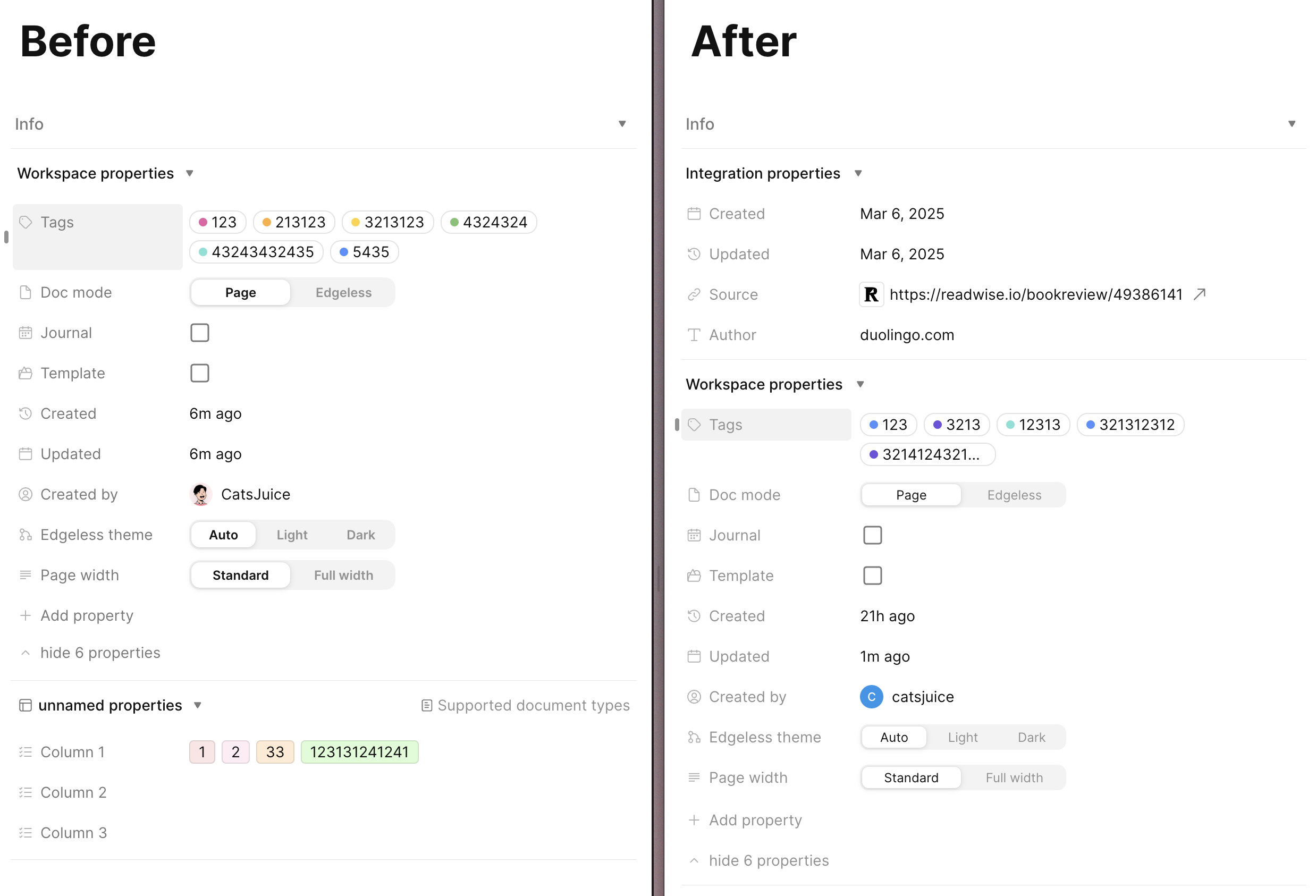
### New all docs list ui
close AF-2531, AF-2585, AF-2586, AF-2580

### What changed

- a new `display-menu` component
  - properties visibility
  - quick actions visibility
- extend DocPropertyType definition
  - `showInDocList`: configure whether to show in doc and how to show (stack | inline)
  - `docListProperty`: define how to render property in doc
  - `groupHeader`: define how to render group header when grouped
- implement all properties's `docListProperty` renderer and `groupHeader` renderer
- new `docs-view` component
  - render doc in `card` | `list` view
  - split doc card into minimal components for reuse in list and card views, as well as visibility control
- implement docs-list with `<Masonry />` and multi-view support
  - for list view, make masonry column count always `1`

<!-- This is an auto-generated comment: release notes by coderabbit.ai -->
## Summary by CodeRabbit

- **New Features**
  - Redesigned document explorer with multiple view modes (list, grid, masonry), grouping, selection, and multi-delete.
  - Added customizable display properties and quick actions (favorite, trash, split view, new tab, select) for documents.
  - Introduced new group header and document item components with improved styling and interaction.
  - Enabled dynamic rendering of document properties including tags, dates, users, templates, and themes.
  - Added filtering support for trash status and enhanced localization for UI elements.
  - Introduced drag handle size customization and expanded masonry layout configurability.
  - Added contextual "More" menu with document operations like favorite, info, duplicate, and trash.
  - Implemented shared context for explorer state management and multi-selection logic.

- **Enhancements**
  - Improved virtual scrolling with active item tracking and configurable preload and debounce settings.
  - Responsive, theme-aware styling applied across explorer and property components.
  - Configurable UI elements and quick actions via user preferences.
  - Enhanced error messages for unsupported property types in filters.
  - Refined padding and layout calculations in masonry component for better visual consistency.
  - Avatar and date components refactored for explicit prop-driven rendering and customization.

- **Bug Fixes**
  - Improved error messages for unsupported property types in filters.

- **Documentation**
  - Added new localization keys and updated language completeness for new features.

- **Chores**
  - Modularized workspace property types with list and group header display components.
  - Consolidated imports and enhanced code maintainability.
  - Added new CSS styling modules for explorer components and workspace property types.
<!-- end of auto-generated comment: release notes by coderabbit.ai -->
- support group for masonry
- expand/collapse group
- sticky group header

<!-- This is an auto-generated comment: release notes by coderabbit.ai -->
## Summary by CodeRabbit
- **New Features**
- Enhanced Masonry component with support for grouped items, collapsible and sticky group headers.
- Added multi-view transitions enabling switching between Masonry, Grid, and List layouts.
- Introduced virtual scrolling with group support for efficient handling of large datasets.
- New interactive storybook demonstrations showcasing grouped and multi-view Masonry scenarios.
- **Improvements**
- List view styling enhancements for improved clarity and layout.
- Resize panel now supports customizable offset modifications during drag interactions.
<!-- end of auto-generated comment: release notes by coderabbit.ai -->
whats changed:
### orm
add a new `select$` method, can subscribe on only one field to improve batch subscribe performance
### yjs-observable
add a new `yjsObservePath` method, which can subscribe to changes from specific path in yjs. Improves batch subscribe performance
```ts
yjsGetPath(
this.workspaceService.workspace.rootYDoc.getMap('meta'),
'pages'
).pipe(
switchMap(pages => yjsObservePath(pages, '*.tags')),
map(pages => {
// only when tags changed
})
)
```
### standard property naming
All `DocProperty` components renamed to `WorkspaceProperty` which is consistent with the product definition.
### `WorkspacePropertyService`
Split the workspace property management logic from the `doc` module and create a new `WorkspacePropertyService`. The new service manages the creation and modification of properties, and the `docService` is only responsible for storing the property value data.
### new `<Filters />` component
in `core/component/filter`
### new `<ExplorerDisplayMenuButton />` component
in `core/component/explorer/display-menu`

### new `/workspace/xxx/all-new` route
New route for test components and functions
### new collection role service
Implemented some filter group order rules
see `collection-rules/index.ts`
### standard property type definition
define type in `modules\workspace-property\types.ts`

define components (name,icon,....) in `components\workspace-property-types\index.ts`

<!-- This is an auto-generated comment: release notes by coderabbit.ai -->
## Summary by CodeRabbit
- **New Features**
- Introduced comprehensive filtering, grouping, and ordering capabilities for workspace documents with reactive updates.
- Added a new "All Pages" workspace view supporting dynamic filters and display preferences.
- Developed UI components for filter creation, condition editing, and display menu controls.
- Launched enhanced tag management with inline editors, selection, creation, and deletion workflows.
- Added workspace property types with dedicated filter UIs including checkbox, date, tags, and text.
- Introduced workspace property management replacing document property handling.
- Added modular providers for filters, group-by, and order-by operations supporting various property types and system attributes.
- **Improvements**
- Standardized tag and property naming conventions across the application (using `name` instead of `value` or `title`).
- Migrated document property handling to workspace property-centric logic.
- Enhanced internationalization with additional filter and display menu labels.
- Improved styling for filter conditions, display menus, and workspace pages.
- Optimized reactive data subscriptions and state management for performance.
- Refined schema typings and type safety for workspace properties.
- Updated imports and component references to workspace property equivalents throughout frontend.
- **Bug Fixes**
- Resolved tag property inconsistencies affecting display and filtering.
- Fixed filter and tag selection behaviors for accurate and reliable UI interactions.
- **Chores**
- Added and refined test cases for ORM, observables, and filtering logic.
- Cleaned up legacy document property code and improved type safety.
- Modularized and restructured components for better maintainability.
- Introduced new CSS styles for workspace pages and display menus.
- Added framework module configurations for collection rules and workspace property features.
<!-- end of auto-generated comment: release notes by coderabbit.ai -->
Sometimes, missing `await` in the test code can cause timing issues, leading to test failures. This PR enables the `no-floating-promises` rule for the test code to ensure that such errors do not occur.
1. page list item are bound two draggables. adding `draggable` prop to WorkbenchLink to mitigate the issue.
2. DndService may not resolve datatransfer when dragging.
 Cats Juice